Modern, Fun, or Elegant? The 7 Best Google Font Pairings in 2027
Choosing fonts for your website starts out pretty fun. Who hasn’t lost three hours to Creative Market or swapping through fonts on Canva?
But eventually, you find yourself flipping back and forth between either two nearly identical fonts or two completely different styles, wondering which one you want to commit to long-term.
And which one actually represents your brand personality.
So we’re here to help you narrow things down.
Samara, In Tandem Studios co-founder and the brilliant designer behind all our client websites, has picked seven of the best Google font pairings for different brand personalities.
(With examples and tips for using each one.)
They’re all free, and with Samara doing the choosing, you get to skip the “do these fonts even work together?” part and just focus on which pairings feel like your business.
What is a Google Font Pairing?
Google Fonts is a big library of free, open-source fonts. Choose two that work well together, usually one for headings and one for paragraphs, and you’ve got yourself a Google font pairing.
One reason we love Google Fonts (besides the very appealing price of $0) is that sooooo many are available in tools you’re already using, like Squarespace and Canva.
Which means the fonts on your website can also show up in your Instagram graphics, presentations, and other marketing materials. Much easier to keep everything feeling like the same business when you can actually find the same fonts.
1. Elegant & Elevated Google Font Pairing
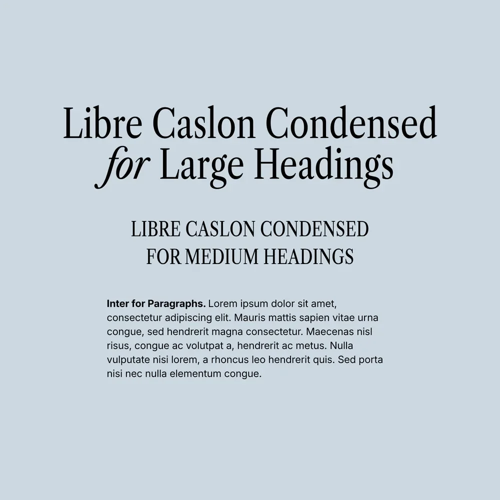
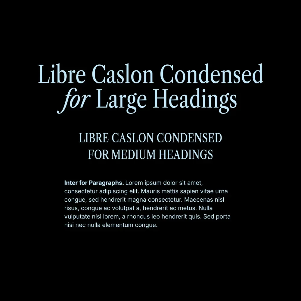
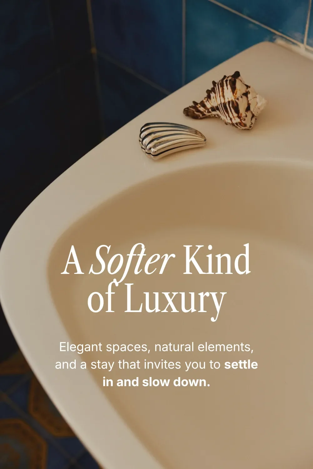
Headings: Libre Caslon Condensed
Paragraphs: Inter
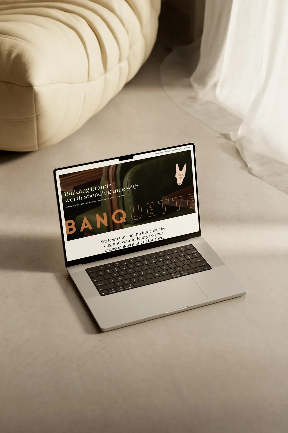
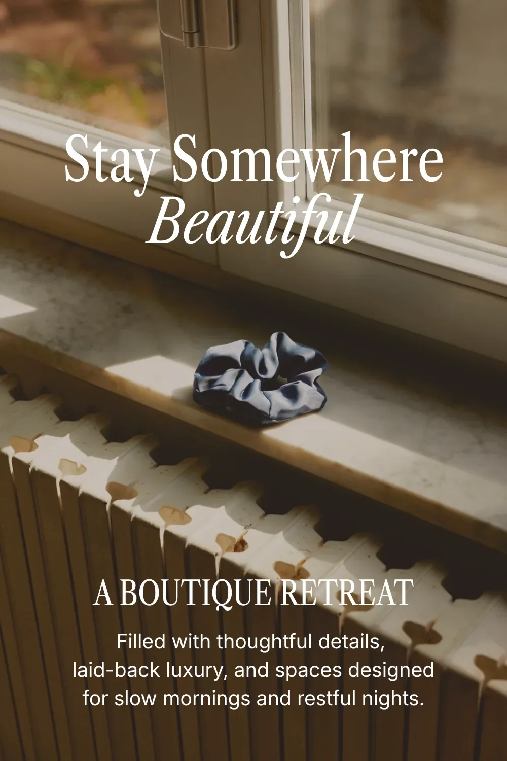
Elegant, elevated, and a little editorial. This pairing gives your website a sophisticated feel, with enough personality in the headings to make you want to look a little closer.
Perfect for: photographers, wedding professionals, interior designers, boutique hospitality brands, coaches, and creative studios. If refined and polished are on your branding wish list, start here.
Why this font pairing works:
Libre Caslon Condensed has narrow letterforms that give your headings their elegant feel. Inter’s simple sans-serif keeps the paragraphs easy to read, so you can enjoy the lovely typography and get through the copy.
How to use it:
Libre Caslon Condensed has beautiful italics, and we would absolutely take advantage of them. Try italicizing a few words within a heading to draw attention to a particular phrase, or use all-caps for short headings.
For paragraphs, start with Inter Regular (400). We’d choose that over a lighter weight for longer sections of copy: it’s comfortable to read and leaves you room to bold the words you want people to notice.
2. Clean & Modern Google Font Pairing
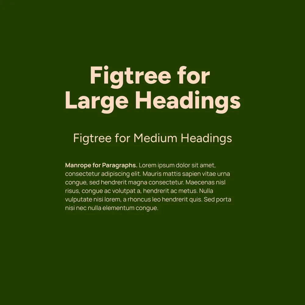
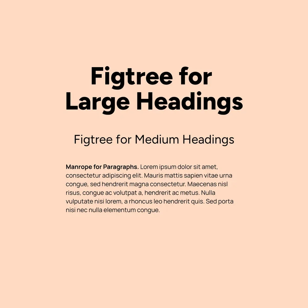
Headings: Figtree
Paragraphs: Manrope
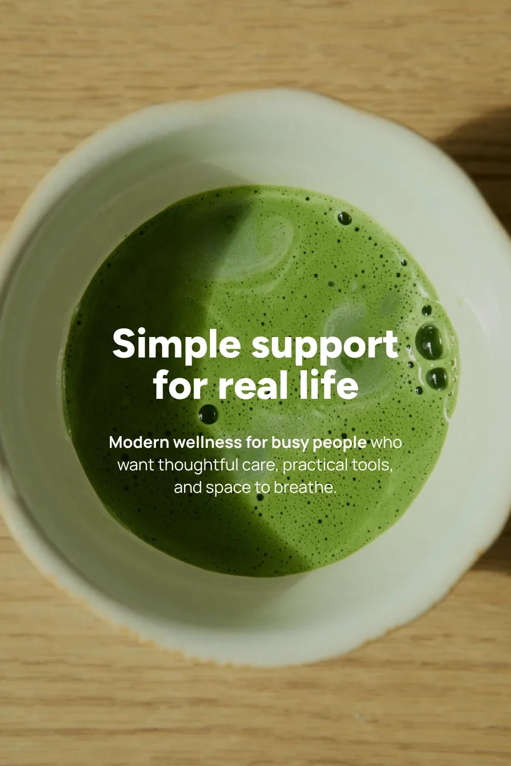
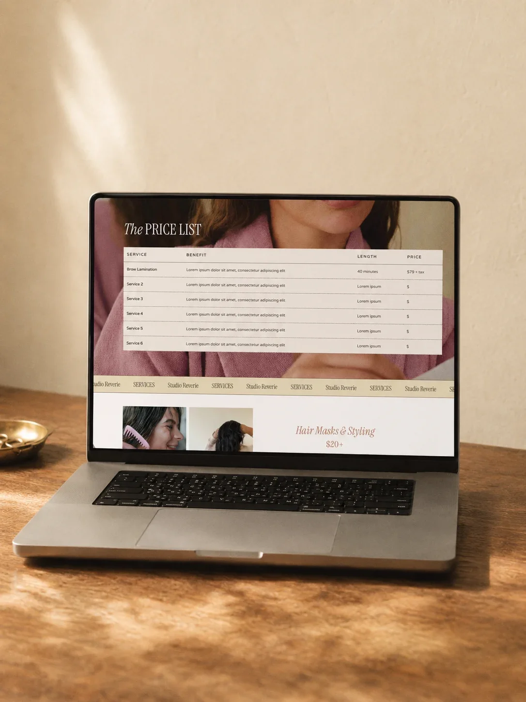
For the brand that’s confident, approachable, and pretty happy to keep things simple. Figtree and Manrope give you that clean, modern look with a personable feeling that makes it easy to warm up to.
Perfect for: consultants, service providers, tech companies, wellness brands, agencies, and personal brands who want their expertise and their welcoming side to come across together.
Why this font pairing works:
Figtree and Manrope both have a clean sans-serif style, so they already feel like they belong together. From there, you can play with size and weight to give different parts of your copy their own emphasis.
How to use it:
Try Figtree ExtraBold or Black for large headings, then a lighter weight for medium-sized ones. You’ll get contrast between your headings while keeping them in the same font family.
Manrope works well for paragraphs, but give it a turn on your buttons and calls to action, too. All-caps adds a little emphasis to short subheadings or button text to draw readers’ attention.

3. Whimsical & Vintage Google Font Pairing
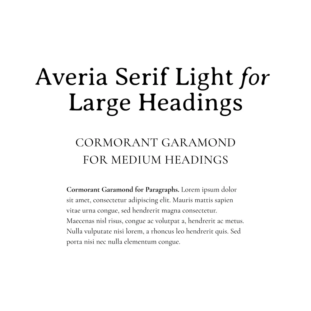
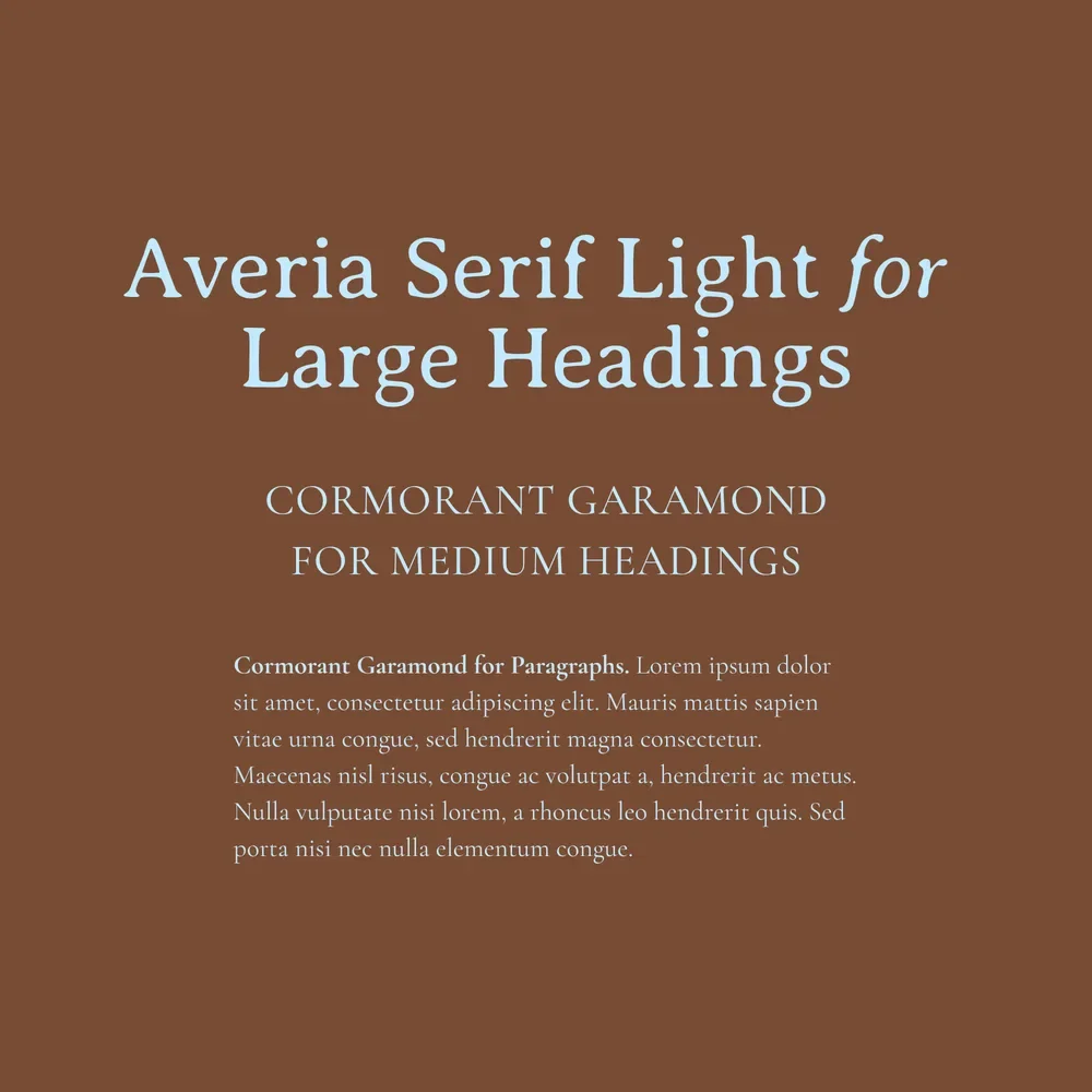
Headings: Averia Serif Light & Cormorant Garamond
Paragraphs: Cormorant Garamond
This pairing has an old-world, storybook feel: classic, a little rugged, and like it could have been pulled straight from the pages of Lord of the Rings.
Perfect for: artists, florists, authors, makers, boutique shops, slow-living brands, and nature-inspired businesses that lean a little nostalgic and unconventional.
Why this font pairing works:
Averia Serif Libre is a playful serif with a slightly rugged feel. Cormorant Garamond brings a more refined style to the pairing, making the overall look more classic while keeping the character that caught your eye in the first place.
How to use it:
Use Averia Serif Libre’s Light weight for your main headings, then Cormorant Garamond for secondary headings and paragraphs. That gives you a little more variety within the pairing.
Cormorant Garamond brings that old-fashioned book feeling to your paragraphs, but size really matters here. Start around 16–17px, then check a full paragraph on your phone and go larger if it feels small or hard to read.


4. Bold & High-Impact Google Font Pairing
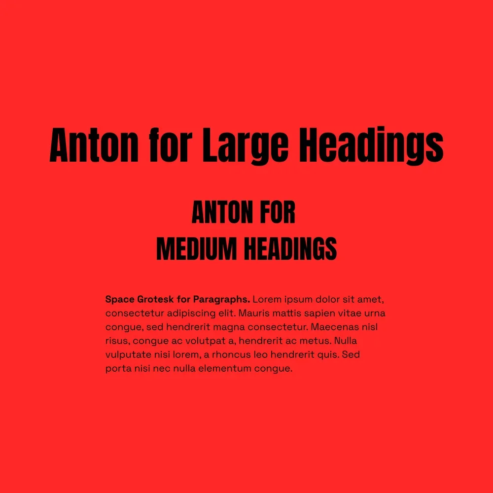
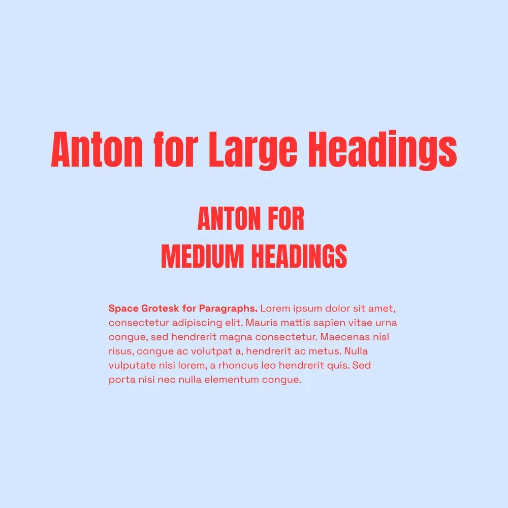
Headings: Anton
Paragraphs: Space Grotesk
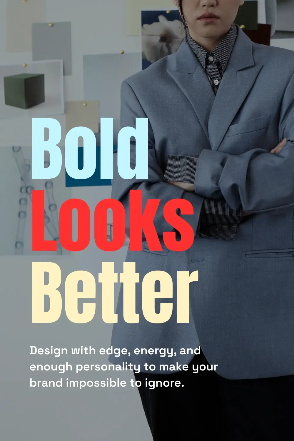
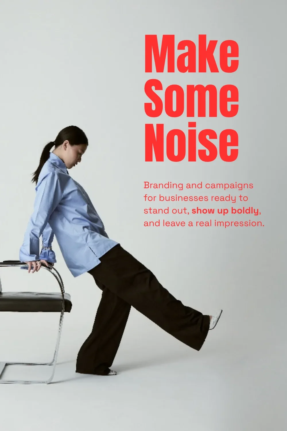
Anton and Space Grotesk bring a bold, modern, high-impact feeling to your website, with PLENTY of energy and room for expression.
Perfect for: fitness brands, restaurants, events, creative agencies, fashion brands, musicians, and modern product-based businesses that want to make a big impression.
Why this font pairing works:
Anton grabs attention with its bold sans-serif style, while Space Grotesk brings a slightly playful, creative feeling to the paragraphs. The personality carries through from the big statement to the details underneath it.
How to use it:
Give Anton the large headings and short statements you want people to notice. It’s already a heavy font, so play with size and spacing rather than weight to get the feeling you want.
Use Space Grotesk for paragraphs and smaller supporting text. Start with a regular weight for longer sections of copy, then try heavier weights for short subheadings or calls to action.
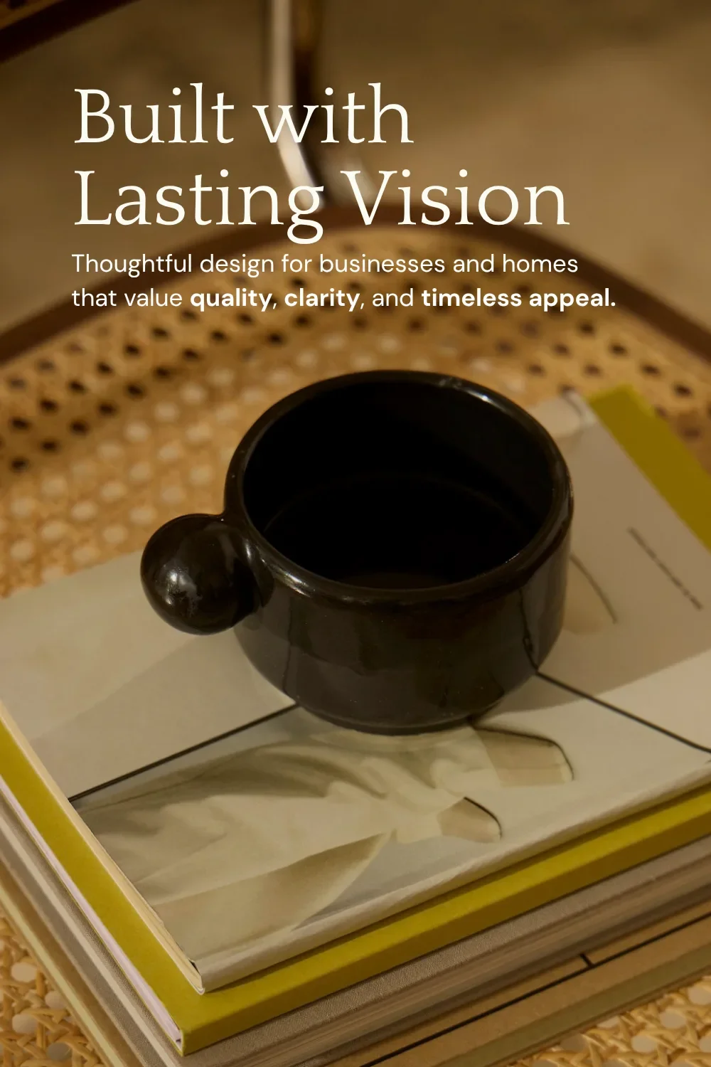
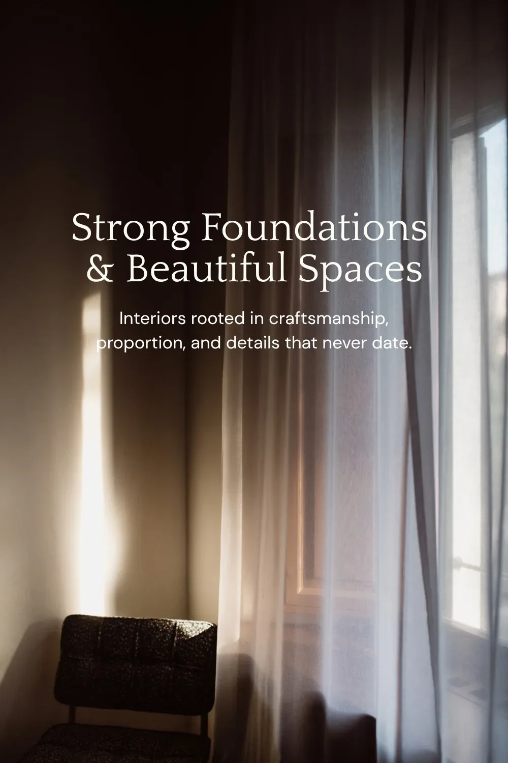
5. Classic & Strong Google Font Pairing
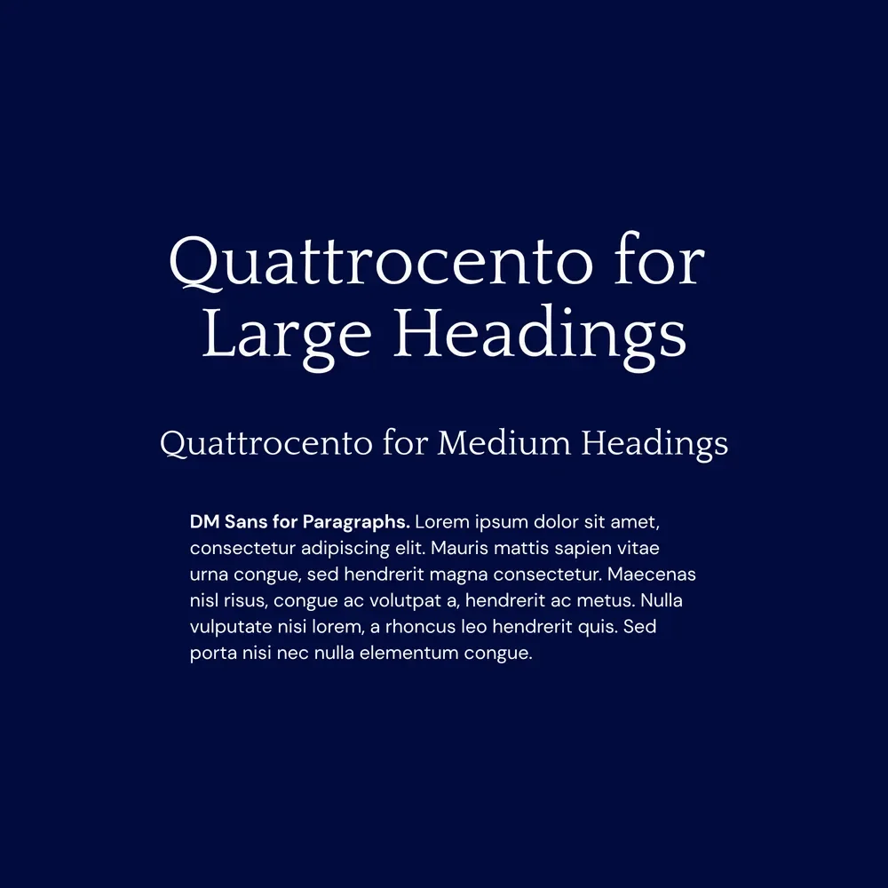
Headings: Quattrocento
Paragraphs: DM Sans
Classic, elegant, and strong, with little details that deserve a closer look. This font pairing keeps the overall feeling clean while giving your branding some character.
Perfect for: architects, interior designers, consultants, luxury service providers, real estate brands, and established small businesses whose branding should feel trustworthy and timeless.
Why this font pairing works:
Quattrocento balances softer and stronger details in its serif style, while DM Sans brings a simple, readable sans-serif to the mix. AKA: character in the headings and clarity in your paragraphs.
How to use it:
Try Quattrocento in larger headings so you can actually see its interesting details, including that very fun Q! Yes, we have favourite letters. This is what happens when you work on websites all day.
DM Sans is designed for smaller text sizes, making it well suited to paragraphs. Choose Regular (400) or Medium (500) for your body text, then play with bolder weights to emphasize important words or phrases.

6. Feminine & Airy Google Font Pairing
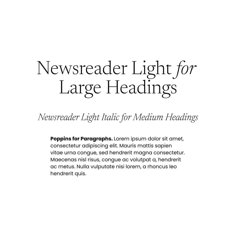
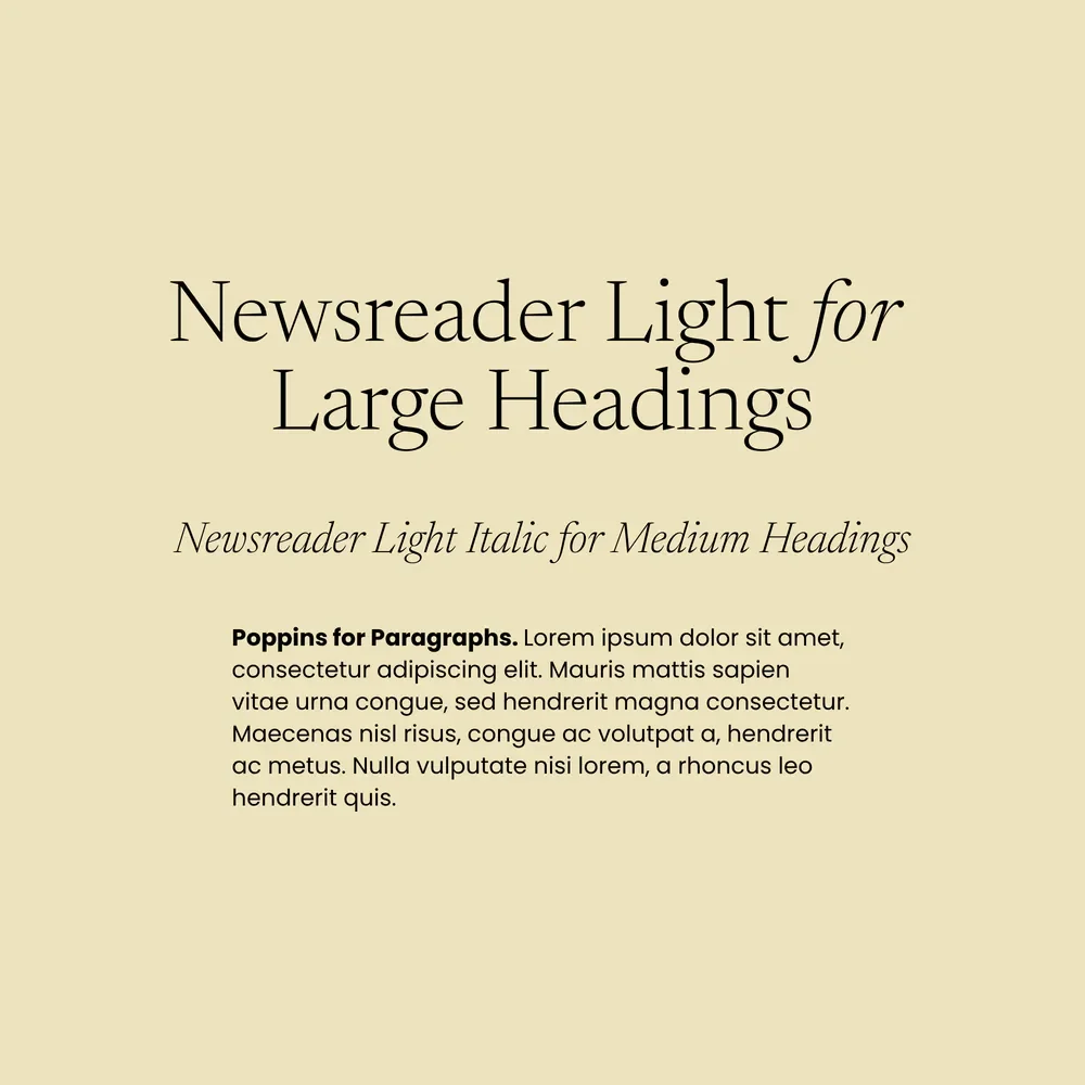
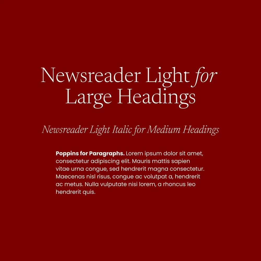
Headings: Newsreader Light
Paragraphs: Poppins
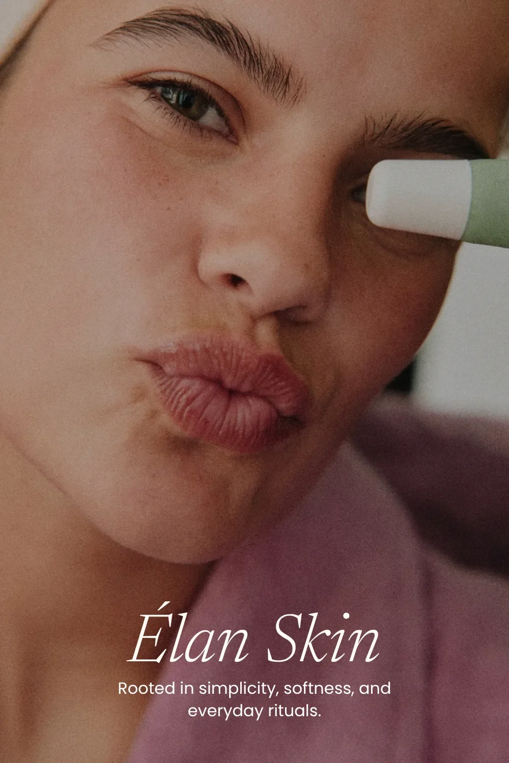
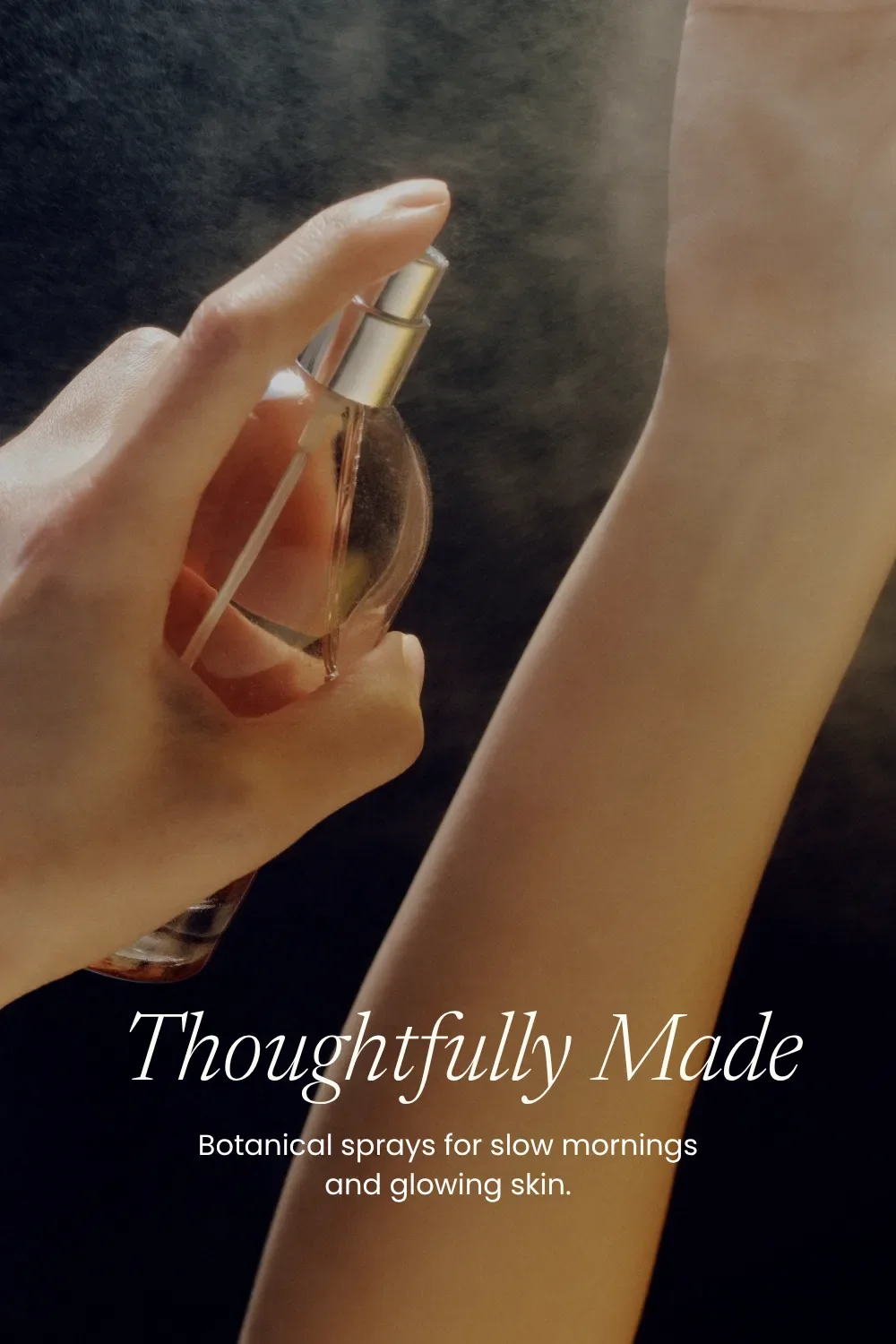
Love a soft, romantic look? Then we’d put this feminine font pairing on your shortlist for an elegant yet simple look that works beautifully for a more understated brand.
Perfect for: photographers, florists, jewellers, skincare brands, home goods, and wellness practitioners whose Pinterest boards are filled with hand-drawn designs and delicate details.
Why this font pairing works:
Newsreader brings a feminine serif style, while Poppins (a designer favourite thanks to its versatility) adds contrast as a clean, geometric sans-serif.
How to use it:
Use Newsreader Light for airy main headings, with its beautiful Light Italic for smaller headings (H3s). There are TONS of weights available, so you can play with how delicate or strong the headings feel.
Poppins is that girl for paragraphs, but try all-caps for short subheadings or calls to action. Just remember the letter spacing! A little extra room between those capitals makes a big difference in readability.
7. Fun & Youthful Google Font Pairing
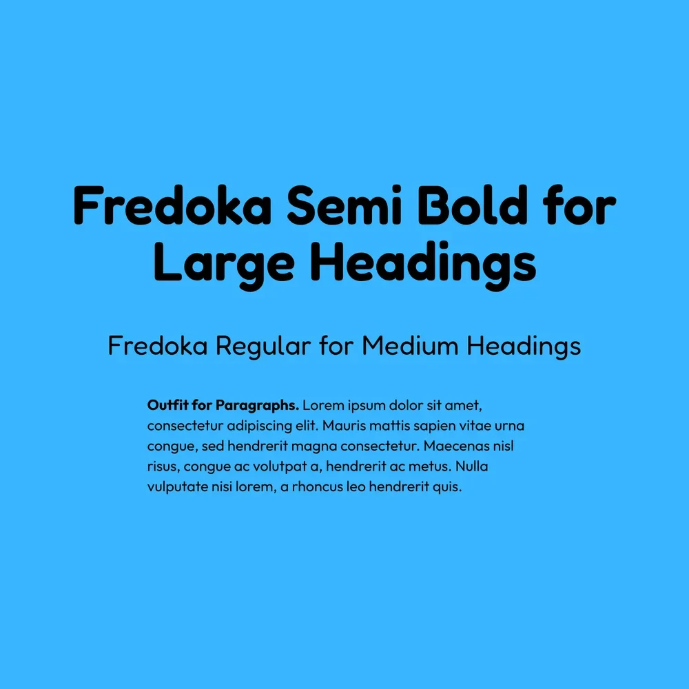
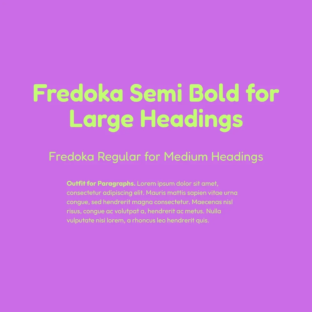
Headings: Fredoka Bold
Paragraphs: Outfit
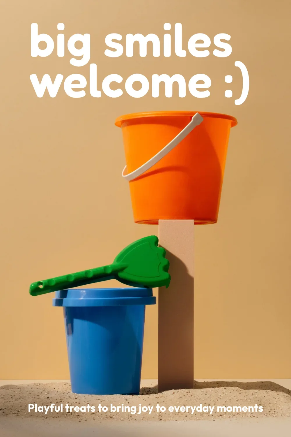
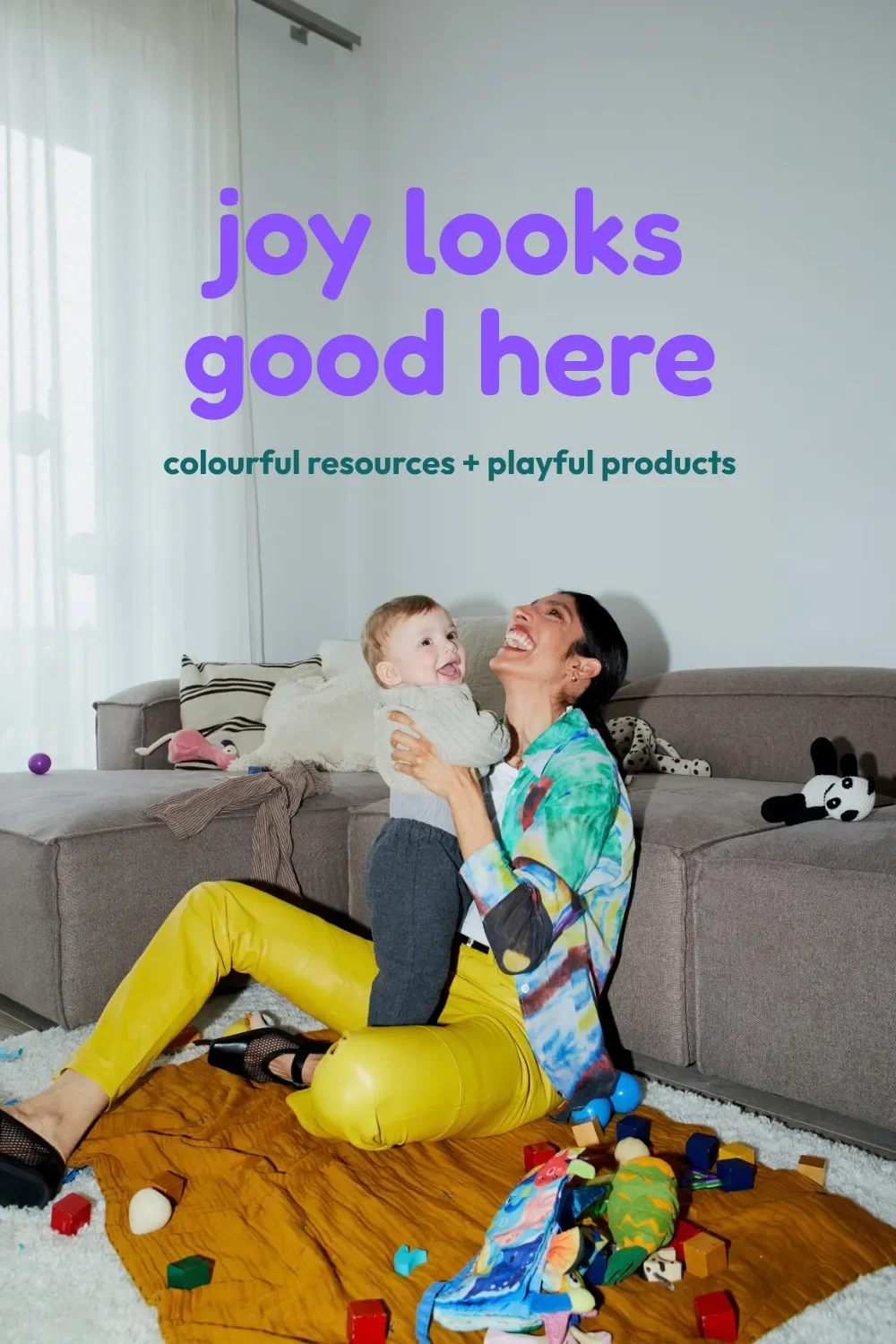
This pairing is cheerful and expressive, with a youthful feeling that makes it a great fit for brands with an outgoing personality.
Perfect for: children’s brands, toy shops, educators, creative studios, ice cream shops, and community organizations where colourful designs and a little playfulness feel right at home.
Why this font pairing works:
Fredoka’s rounded curves and soft edges give the headings their fun character. At the same time, Outfit’s simple, clean lines balance the pairing, giving you two sans-serifs with a clear difference between headings and paragraphs.
How to use it:
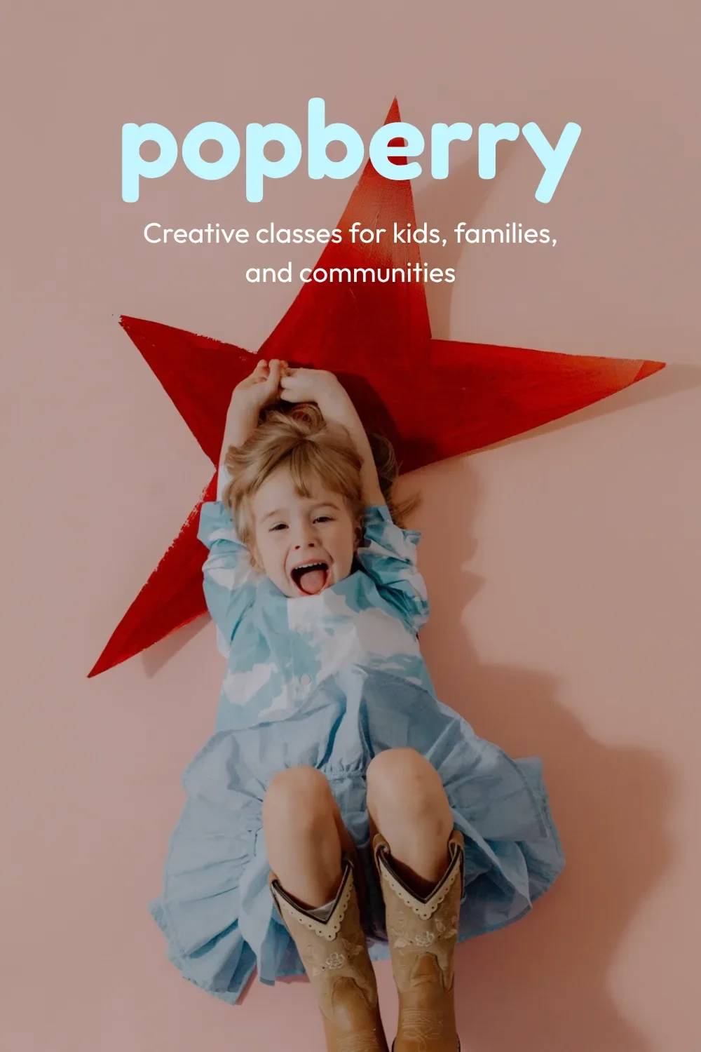
Use Fredoka Bold for eye-catching headings, and don’t be afraid to try your business name in it while you’re experimenting. There’s plenty of potential for a logo in those lovely rounded letters.
Outfit is an easy yes for paragraphs and smaller text. It stays clean and readable when you have more to explain…because even the most enthusiastic heading can only say so much.
Why Are Font Pairings Important?
You already know fonts are important for readability. (We’ve allllllll squinted at a screen, pamphlet, or restaurant menu before trying to decipher just what the heck it was saying.)
But being able to read the words is only part of it.
Your font pairings say something literally with your copy, and figuratively about your brand.
The bold, punchy feeling of Anton gives a different impression than the storybook charm of Averia Serif Libre. Both are great fonts. Which one belongs on your website depends on how you want people to experience your brand.
Do you want your business to feel calm and considered? Energetic and expressive? Warm, familiar, a little nostalgic?
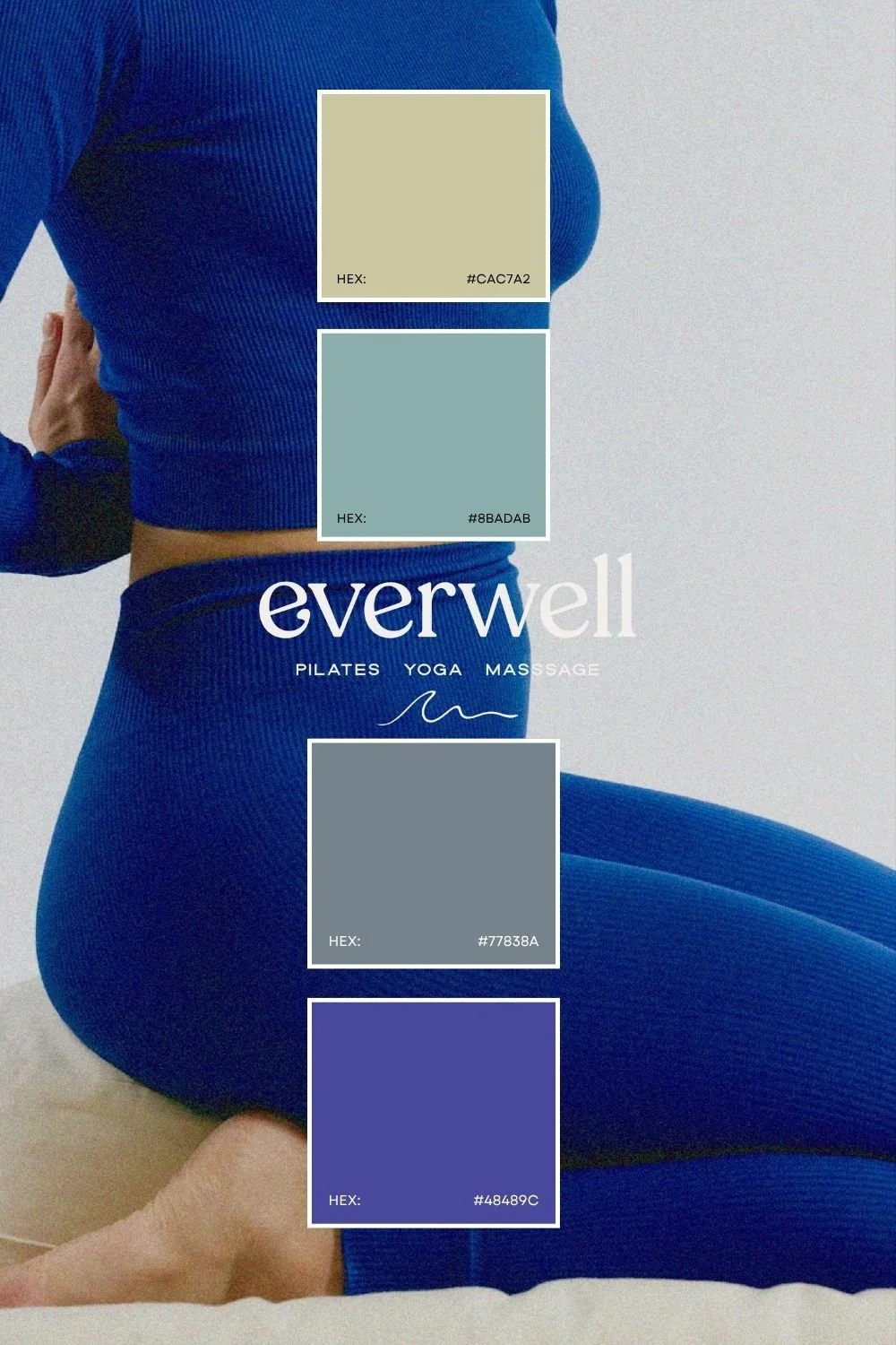
Your fonts help communicate that feeling alongside your colours, photos, copy, and the rest of your design. And when those pieces work together, people get a clearer sense of who you are and whether your business feels like a good fit.
That’s also why we recommend looking at your visual branding as a whole when you’re redesigning your website. If your branding and website feel a bit off, the fonts might be part of it, or your photos, colours, and overall direction might need some attention, too.
Plus, your website designer needs those elements to bring it all together. Fonts included. So getting them sorted beforehand gives your designer what they need and saves you from making another round of branding decisions halfway through your website project.

What Makes a Good Google Font Pairing?
We’ve gone from elegant and editorial to bold and punchy, with a little storybook charm along the way. But across all these Google font pairings, the same things matter: the fonts feel like they belong together, the headings stand out, and the paragraphs are easy to read.
So, with that in mind, here’s what you’re looking for when selecting a good font pairing:
A clear difference between headings and paragraphs. That can come from pairing different font styles like serif and sans-serif, or from playing with size and weight.
Fonts that share a personality. You want them to support the overall brand feeling, even if one is a little more expressive than the other
Fonts that your readers can READ. We love a beautiful handwritten font. But we love being able to read your copy even more.
P.S. If a new website is on the horizon and you’re still figuring out your visual branding, we can pair a Semi-Custom Brand Kit with your website project. Colours, fonts, logos, and website, all working together from the start.
How to Check If a Font Pairing Fits Your Brand
Okay, you’ve found a favourite from the list above. Maybe two. Let’s take them for a spin with your actual business before you spend the afternoon changing every single font on your website.
First, choose three words that describe how you want your brand to come across.
Moody, romantic, and sentimental like Janine’s photography website? Earthy, warm, and connected, like Kaitlin’s massage practice? These words give you something to come back to when you inevitably start liking five completely different styles.
Then, put your own writing into the pairing.
Type a real headline and a full paragraph from your website into the font previews. Seeing your brand name and actual copy in those fonts tells you waaaaay more than another look at the alphabet.
Have a look at the overall feeling.
Does it match those three words you originally identified? Or have you fallen for a font that’s beautiful, but feels like it belongs to somebody else’s business? (It happens to us all at least once.)
Get an outside, expert opinion.
Yeah, we’re talking about us!
You came here to choose fonts. But now you’re looking at your colours, photos, and the rest of your website, wondering whether those need a little love, too. It’s verrrrrrrrrrry easy to turn one small website update into an entire website project.
But before you add all of that to your to-do list, send us your website for a free, Fix-This-First Website Audit.
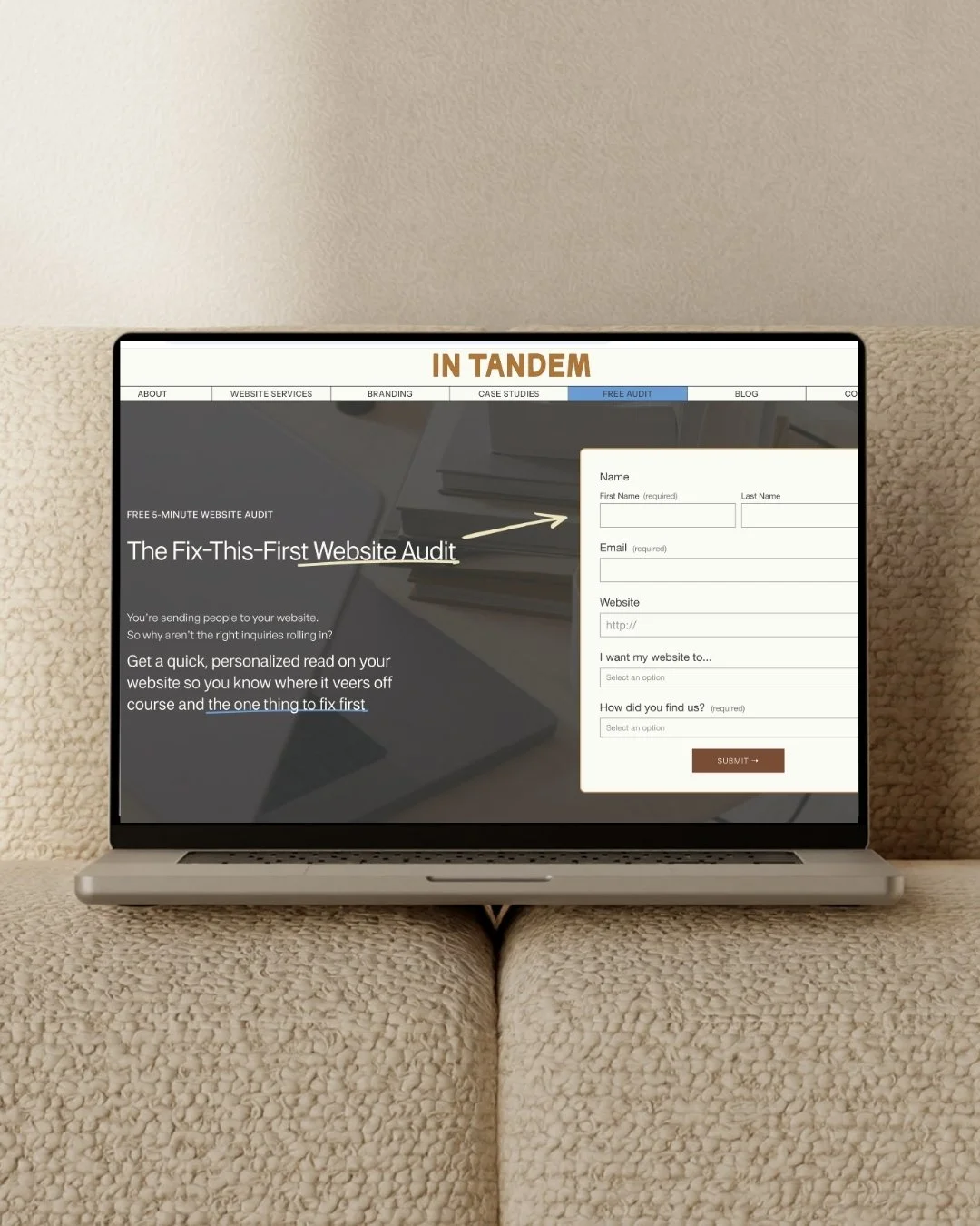
Free! Fix This First Website Audit
We’ll take a look at your copy, design, and user experience, then send back a personalized 5-minute video with one clear fix to focus on first.
It’s a little direction from the two people who spend their days thinking about how all these pieces work together.
FAQs on Google Font Pairings
-
Yes, Google Fonts are free for commercial use, including business websites, logos, social graphics, and printed marketing materials. One less thing to add to your budget? Heck yes.
-
Yes, you can use Google font pairings in Squarespace and Canva, although font and weight availability varies. Both platform libraries include many Google Fonts, but not all.
-
Yes, you can use different weights, sizes, and styles from one font family to create contrast between headings and paragraphs, as suggested in #3 with Cormorant Garamond. Try a larger, bolder weight for headings and a regular weight for body copy so there’s enough difference between the two.