What Are Web-Safe Fonts? (And Does Your Website Need Them?)
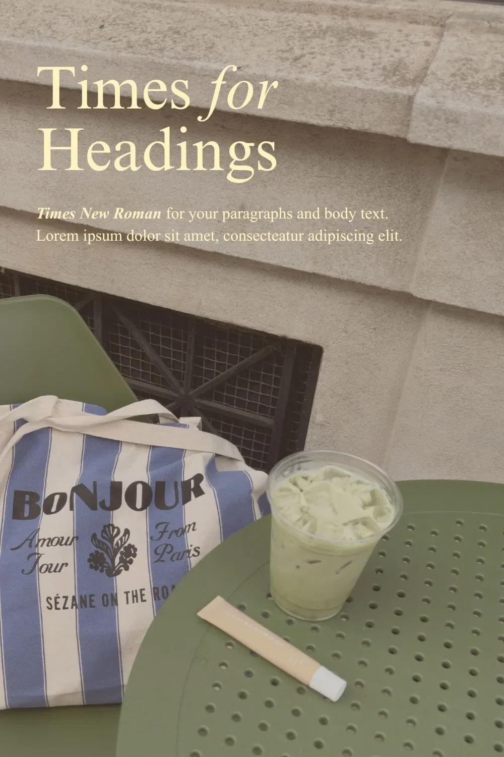
Choosing fonts for your website means thinking about how you want your business to feel. A little romantic? Warm and familiar? Bold enough that no one is skipping by?
Maybe you’ve even taken a look through our Google font pairings, narrowed down your favourites, and found a combination you can picture on your website.
You’re ready to commit.
Finally.
Then another designer term pops up and makes you doubt everything: web-safe fonts.
Safe from what exactly? Are there ~*dAnGeRoUs*~ fonts? Does this mean the pairing you just chose will cause problems?
And if a font is available in your website platform, surely that means it's web-safe…right?
So let’s clear it all up. We’ll explain what web-safe fonts are and why you might want to choose them, then share five designer-approved web-safe pairings you can use right away on your website.
What Are Web-Safe Fonts?
Web-safe fonts are fonts commonly pre-installed on devices, so a browser can display them without downloading a separate font file. Think Arial, Georgia, Verdana, and Times New Roman. You know them, and you’ve definitely used them.
That’s the “safe” part: choosing a font that’s widely available gives you a good chance your visitor already has it installed.
Basically, your website says Georgia, their device has Georgia, and the words appear in Georgia.
Web-Safe Fonts vs Web Fonts
But let’s say you’ve fallen for a Google font pairing and chosen Newsreader for your headings. How does someone see those beautiful italics if they don’t have Newsreader installed on their computer?
Their browser downloads the font files as part of loading your website, alongside things like your photos and logos, so they can see all the brand elements your website designer has included.
That’s how web fonts work. They’re delivered online, whether through a free service like Google Fonts, a paid font library, or files uploaded to your website.
Usually, this all goes on behind the scenes. But a connection problem or an unavailable font file can interrupt the download. Then the browser defaults to a replacement font that’s already available on the device.
So the difference is how the font reaches your reader: a web-safe font is intended to be available on their device already, while a web font can be downloaded when they visit your website.
Does Your Website Need a Web-Safe Font?
No, you don’t have to stick exclusively to web-safe fonts on your website. We don’t in our Semi-Custom Brand Kits and custom branding projects.
Instead, Samara chooses the pairings alongside the colours, logos, and other details, so everything comes together with a particular brand in mind. The pre-installed shortlist would leave out a LOT of creative possibilities.
So why choose a web-safe font?
For one, there’s less to load. If your visitor already has the font installed, their browser can skip downloading that file. That can help your text appear sooner, especially on a slower connection.
And Google is alllllllllll about speedy connections.
It also means you’re less dependent on that download working. Your chosen font is already there, ready to display the words your copywriter has written and your designer has so carefully arranged.
Which matters for the design, too. A different font can change the width of your text, push a heading onto another line, or make a button longer than expected. As a copywriter-designer duo, we spend A LOT of time working through those details together, and we’d prefer a failed font download didn’t get the final say in our design decisions.
The Ultimate List of Standard Web-Safe Fonts
Arial, Verdana, Times New Roman…there are some VERY familiar names on the traditional web-safe font shortlist. But you’ve got options beyond the font you default to whenever you open a new document.
We’ve grouped them by style below, so you can start thinking about which ones might suit your brand.
Sans Serif Web-Safe Fonts
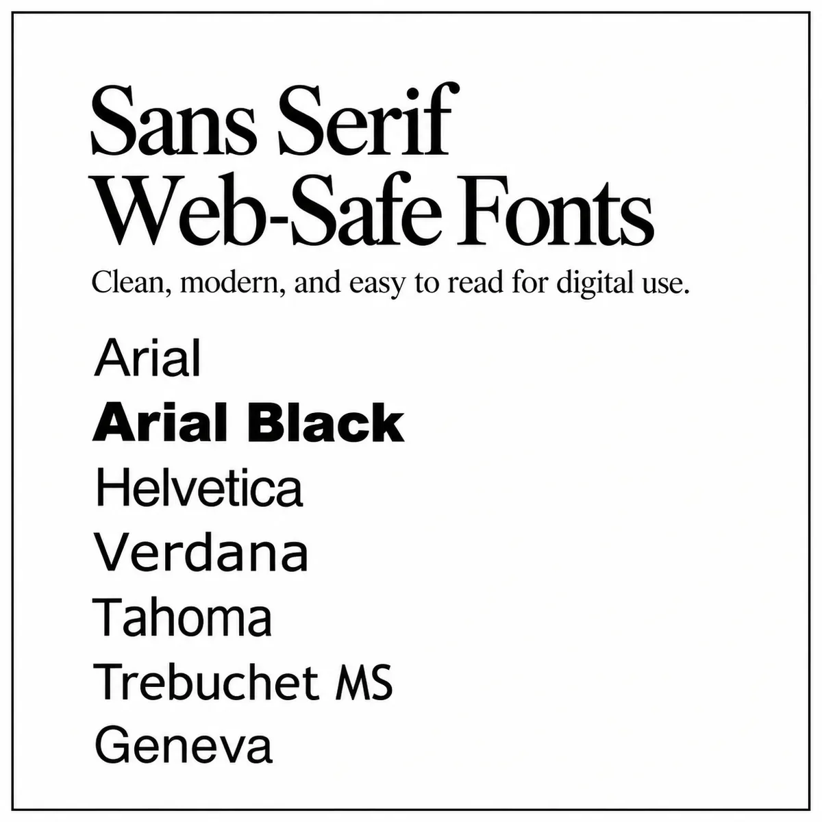
Sans-serif fonts have clean letterforms without the little finishing strokes you’ll see on serif fonts. They can bring a modern, straightforward feeling to your website.
Arial
Arial Black
Helvetica
Verdana
Tahoma
Trebuchet MS
Geneva
Serif Web-Safe Fonts
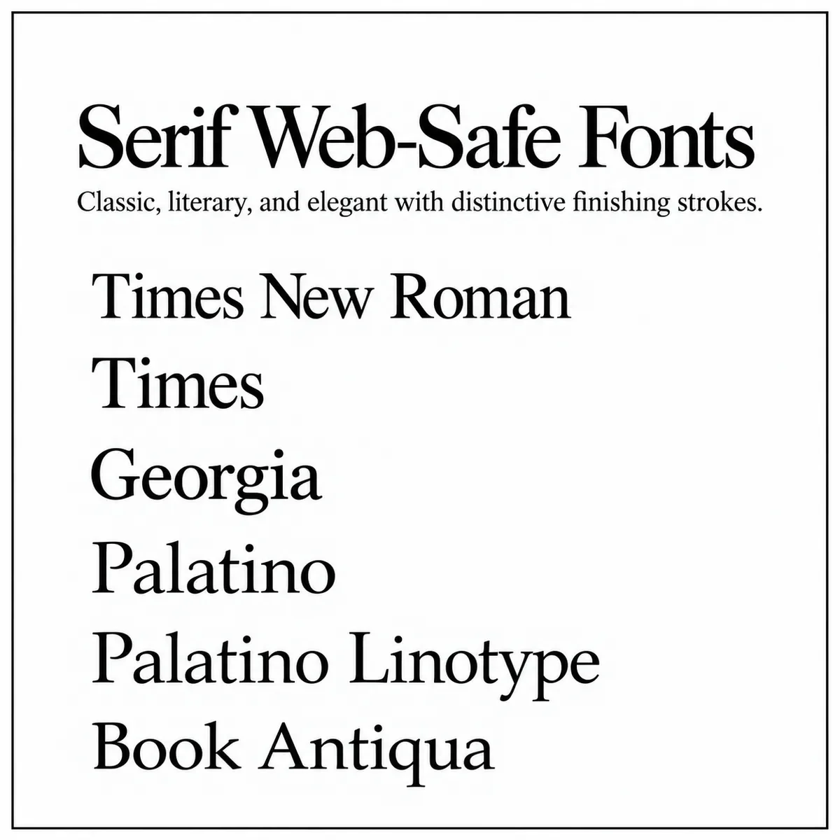
Serif fonts have those small finishing strokes on their letters, often bringing a classic, literary, or refined feeling to a design.
Times New Roman
Times
Georgia
Palatino
Palatino Linotype
Book Antiqua
Monospace Web-Safe Fonts
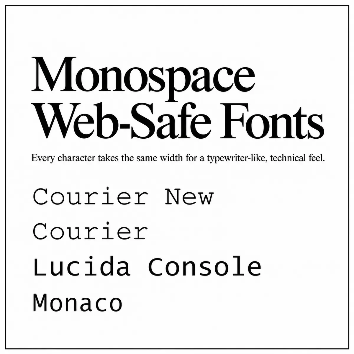
In monospace fonts, every character takes up the same amount of horizontal space, creating a typewriter-esque feeling.
Courier New
Courier
Lucida Console
Monaco
Are Web-Safe Fonts Automatically Accessible?
Web-safe fonts aren’t automatically accessible, though Georgia and Verdana have a little head start since they were designed for on-screen reading.
But a font can be installed on someone’s device and still be hard to read on your website. Especially if you’ve made it tiny, squeezed the lines together, or chosen white text on a pale beige background.
The Web Content Accessibility Guidelines (WCAG) don’t require a specific font, so we can’t choose Georgia and tick “accessibility” off the list. When creating your brand and website, we consider:
Paragraph size. We usually start around 16px, then check how the font reads on different screens. Sometimes a little larger is better.
Distinct characters. Can your readers tell an uppercase “I,” a lowercase “l,” and the number “1” apart?
Line spacing: Around 1.5 times the font size gives us a starting point, with adjustments as needed.
Colour contrast. We check the words against their background, including wherever text sits over a photo.
Clear headings: Size, weight, and spacing help us make the different sections easy to spot during a quick scroll.
If you’re looking at your own website, wondering whether your paragraphs are big enough or your colours have enough contrast, we can help you check.
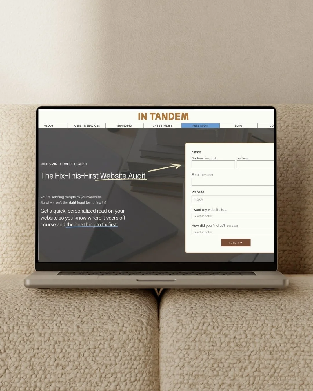
Just send us your site for a free, Fix-This-First Website Audit!
We’ll look at your copy, design, and user experience, then send back a personalized five-minute video showing you one clear fix to focus on first.

5 Designer-Approved Web-Safe Font Pairings
Now for the fun part: seeing what these fonts can do together. Samara has picked five web-safe font pairings that give you the reliability you’re after while still showing off your brand personality.
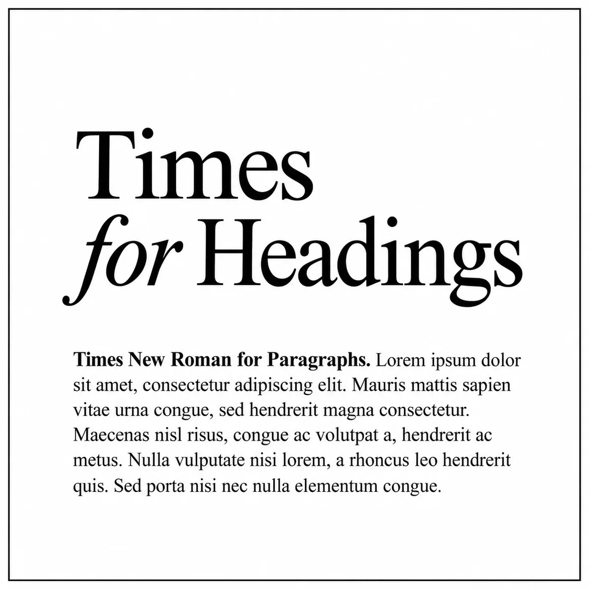
1. Editorial & Timeless Web-Safe Font Pairing
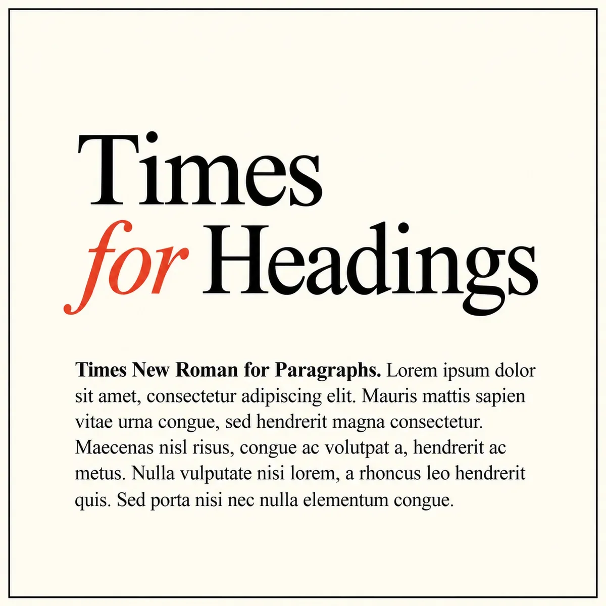
Headings: Times
Paragraphs: Times New Roman
Times and Times New Roman give you that classic, bookish feeling with a subtle, cohesive look since these web-safe fonts share a font family. But this pairing can easily be made more modern by using lots of white space and oversized typography.
Perfect for: writers, publishers, photographers, fashion brands, art studios, consultants, and luxury brands that love a refined, minimalist look.
Brand adjectives:
Editorial · Intellectual · Timeless · Refined · Minimal · Literary
2. Bold & Energetic Web-Safe Font Pairing
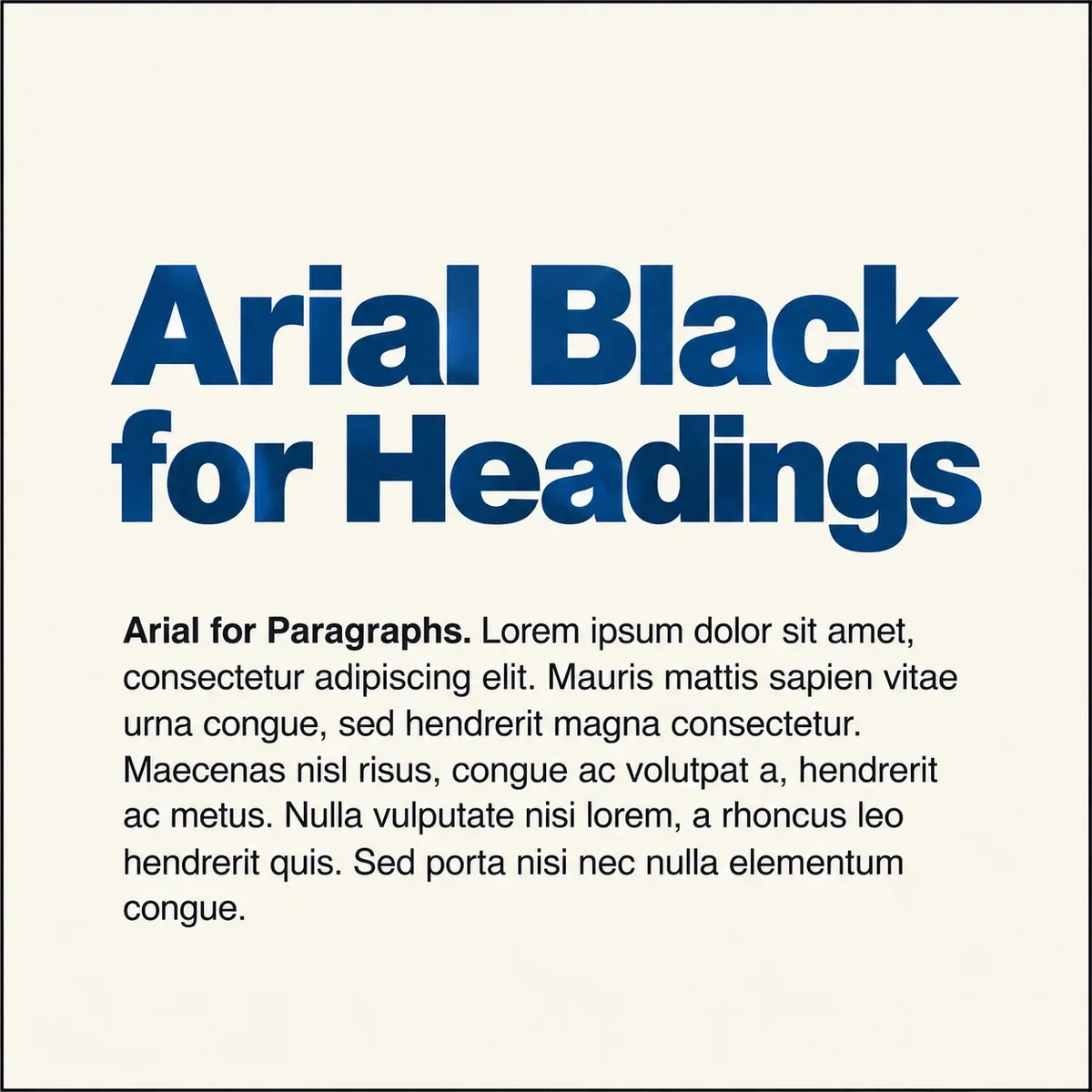
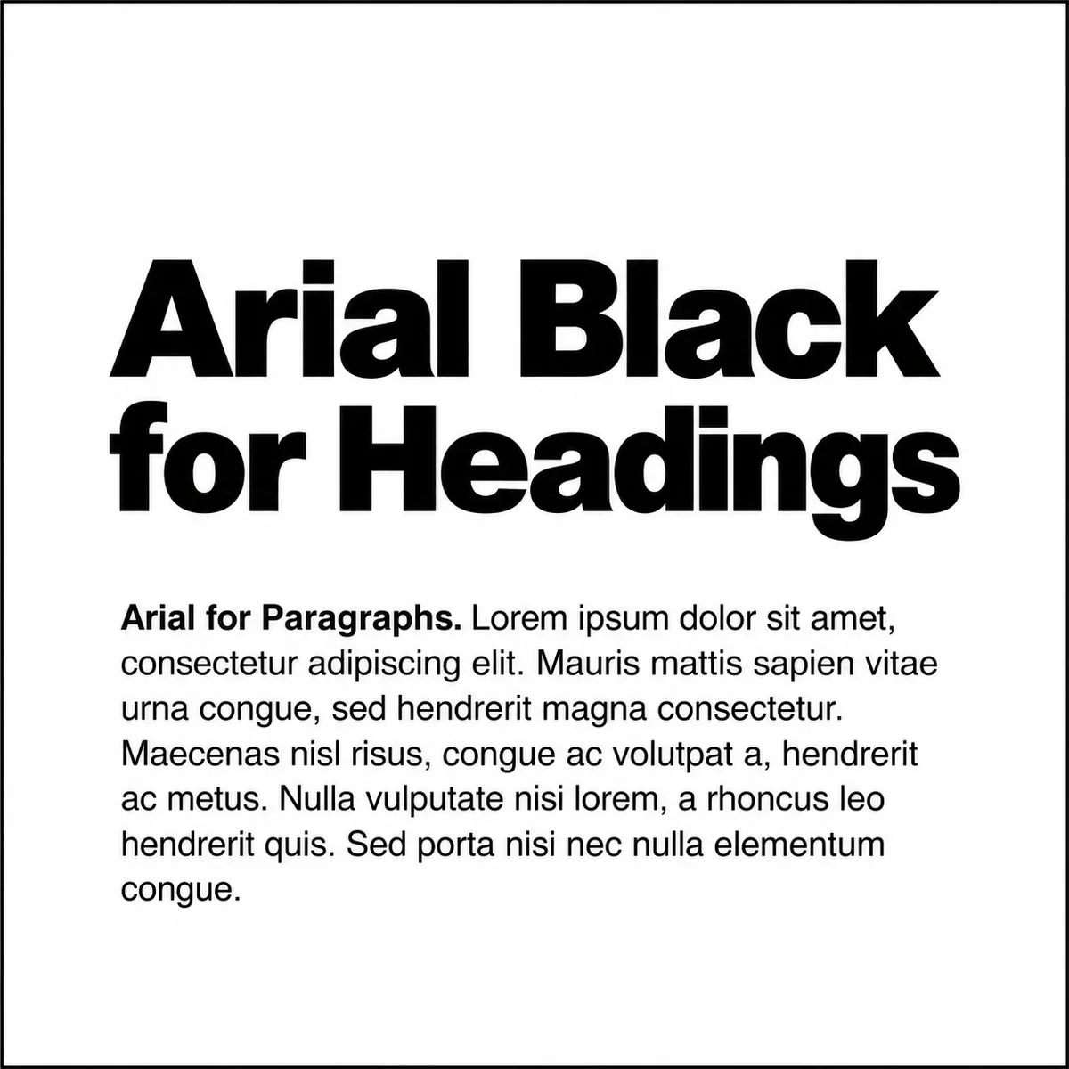
Headings: Arial Black
Paragraphs: Arial
Arial Black and Arial give your website a bold, get-straight-to-the-point feeling. With oversized headings and bright colours, this pairing can look verrrrrry cool, especially when highlighting short, memorable statements.
Perfect for: fitness brands, restaurants, events, creative agencies, sports brands, product businesses, and personal brands that want to make a big statement.
Brand adjectives:
Bold · Strong · Direct · Energetic · Graphic · Confident
3. Sophisticated & Refined Web-Safe Font Pairing
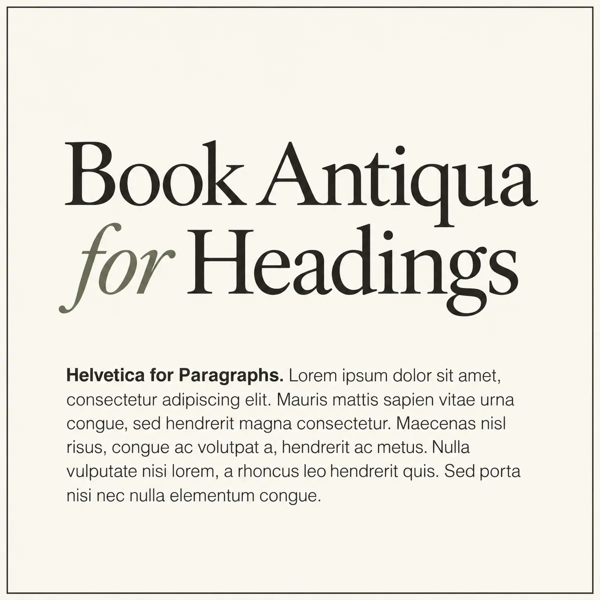
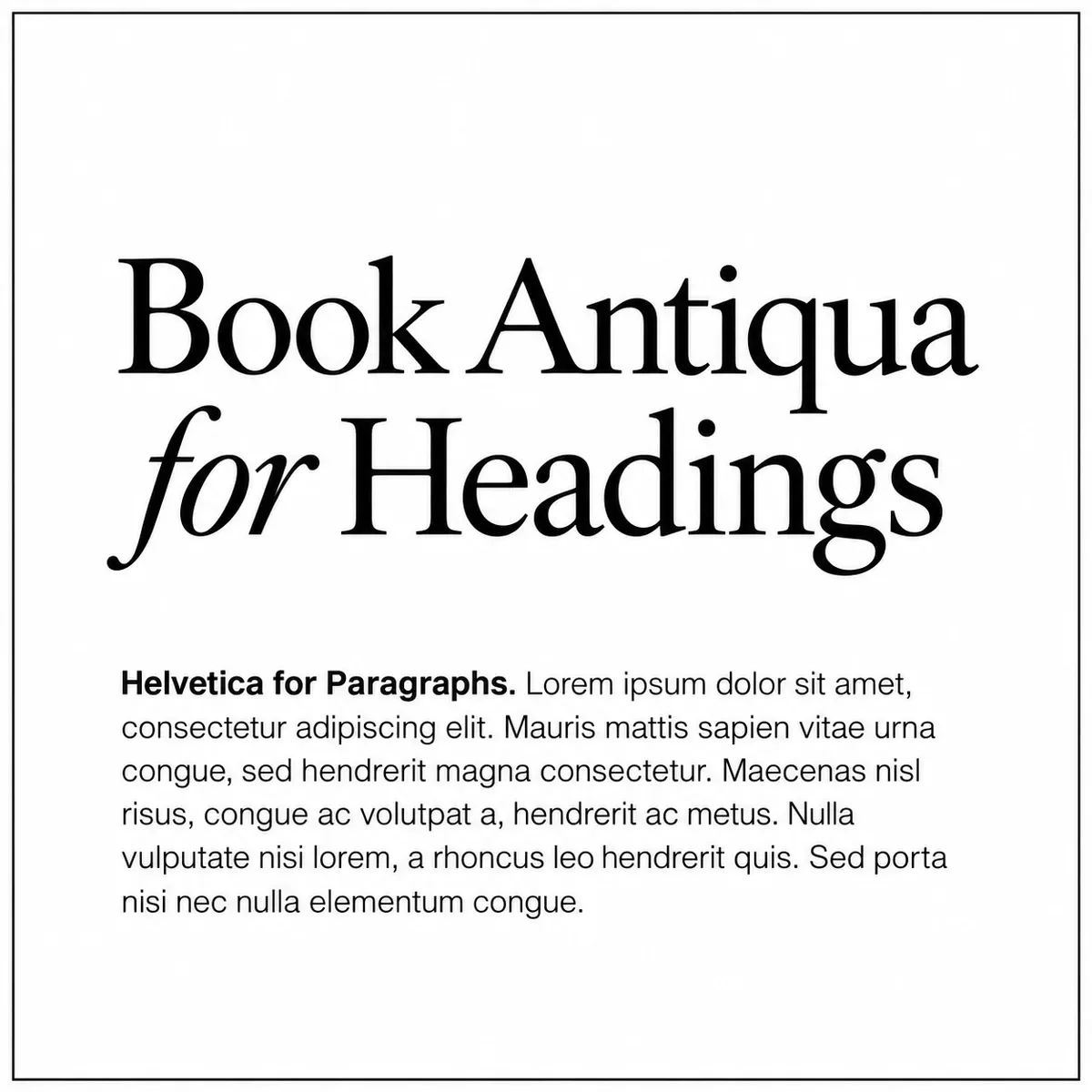
Headings: Book Antiqua
Paragraphs: Helvetica
Book Antiqua’s soft details paired with Helvetica’s more contemporary feeling make this the most traditionally “beautiful” pairing on our list. It has a classic, refined look, with enough warmth to feel welcoming when someone arrives on your website.
Perfect for: interior designers, architects, boutique hotels, and wedding professionals who want to portray themselves as a premium service provider.
Brand adjectives:
Elegant · Warm · Refined · Balanced · Established · Sophisticated
4. Creative & Retro Web-Safe Font Pairing
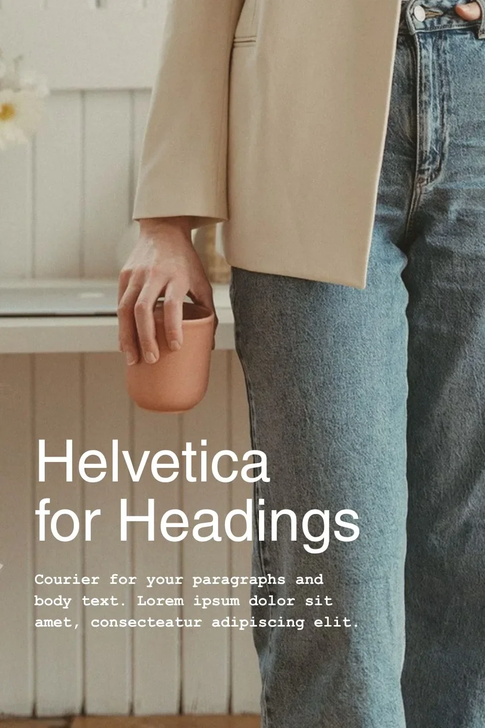
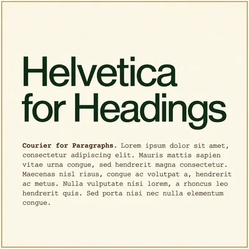
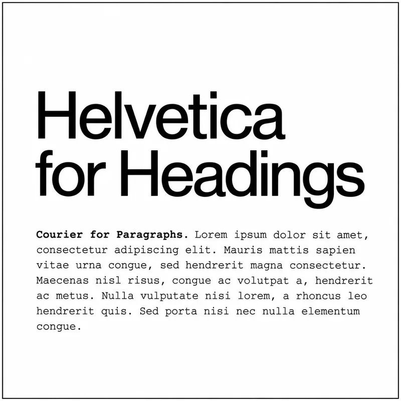
Headings: Helvetica
Paragraphs: Courier
Helvetica and Courier have that independent magazine feeling: a modern look with a little typewriter nostalgia. Helvetica’s simplicity makes Courier’s distinctive letters stand out, so your website feels artistic and a little unexpected.
Perfect for: designers, photographers, artists, fashion brands, musicians, creative studios, magazines, and cultural organizations that like to do things their own way.
Brand adjectives:
Creative · Conceptual · Retro · Cool · Unconventional · Artistic
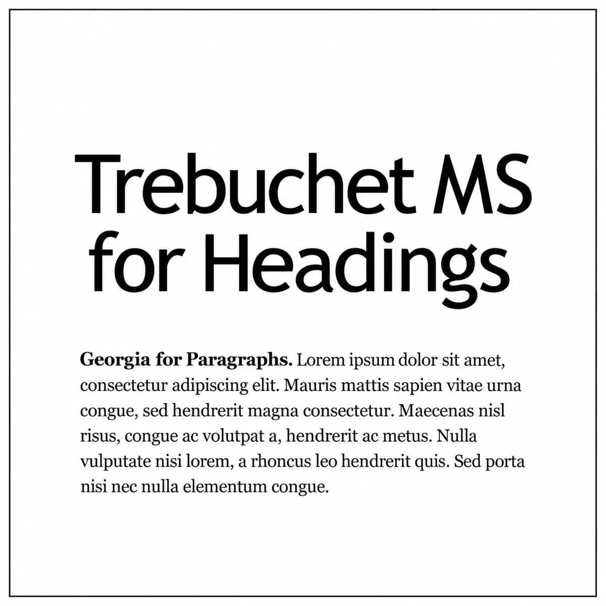
5. Warm & Personable Web-Safe Font Pairing
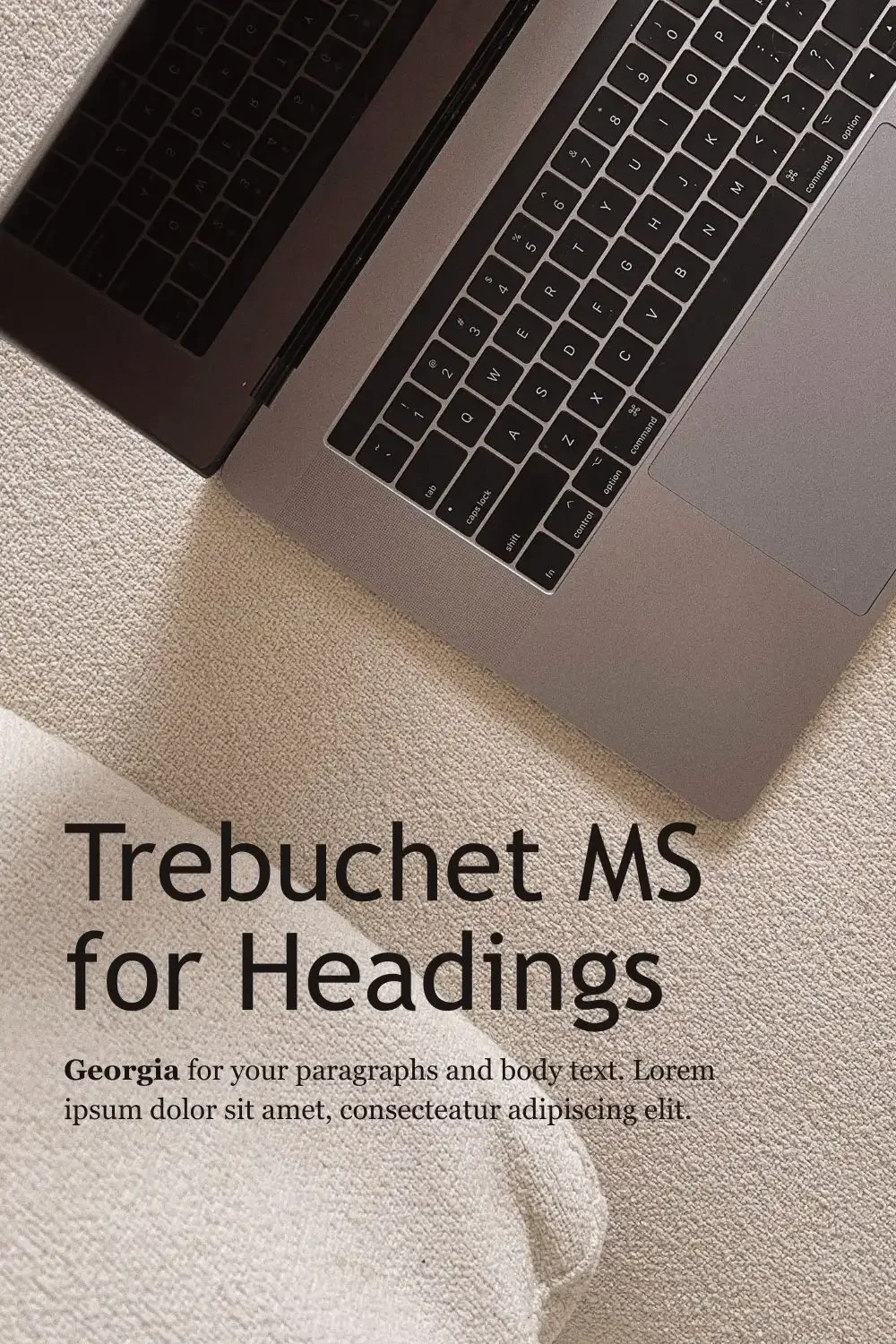
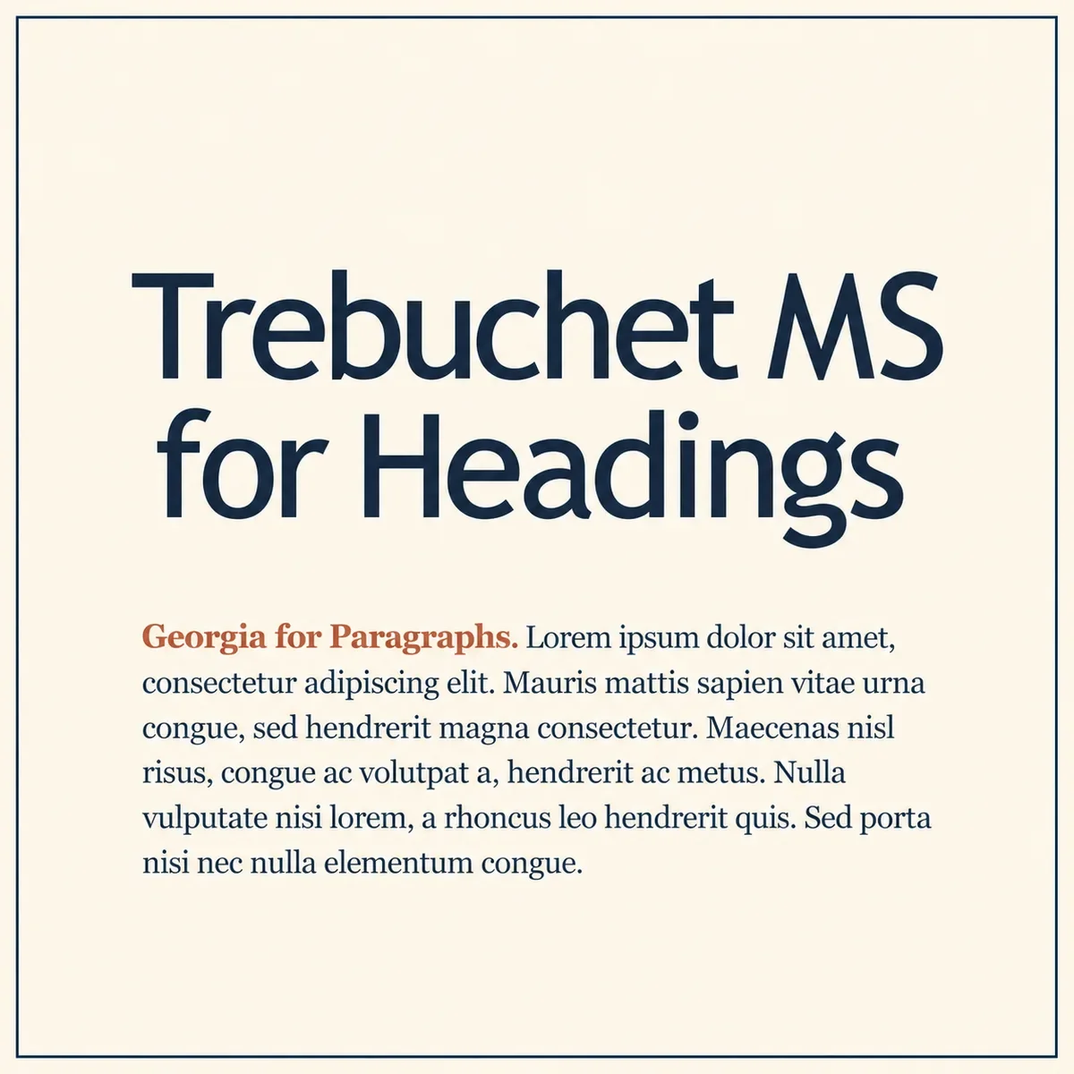
Headings: Trebuchet MS
Paragraphs: Georgia
Trebuchet MS and Georgia bring a little quirk to a classic look. The pairing feels friendly and familiar, with softer headings than you’d get from Arial or Helvetica and paragraphs that stay easy to read when you’ve got more to explain.
Perfect for: educators, coaches, writers, therapists, family-focused businesses, nonprofit organizations with a thoughtful and welcoming approach.
Brand adjectives:
Warm · Friendly · Thoughtful · Approachable · Classic · Personable
What If These Web-Safe Fonts Aren’t Quite Your Style?
Even though web-safe fonts are a great, free option for your website, you don’t have to talk yourself into Times New Roman just because it’s on a web-safe list.
And if you’re choosing colours and a logo, too, that’s a LOT of decisions to make separately.
Our Semi-Custom Brand Kits include fonts, colours, and logos that Samara has designed to work together. You get to see the full combination before choosing your favourite, with the font pairing already sorted.



FAQs on Web Safe Fonts
-
No, Google Fonts are delivered as web fonts, not web-safe fonts, meaning they’re downloaded as your website loads.
-
No, not all the fonts available in Squarespace are web-safe fonts. Squarespace’s font library includes web fonts from Google and Adobe, so it has way more to offer than the pre-installed options.
-
No, you don’t need to change your website’s fonts just because they aren’t web-safe. If they suit your branding and load properly on your website, then absolutely keep them.