
Heart Frequency
Project: Website In A Week
Client: North Wales Intuitive Guide
Destination: A soulful brand and website for stepping fully into her work
Journey Style: Nurturing, elemental, luminous
Context:
Sara had spent years offering energy healing and sound baths within her North Wales community.
The work itself came naturally to her. But publicly claiming her identity as a psychic? That was harder.
Even though her intuitive abilities had been a part of her life since childhood, Sara had spent nearly 30 years working in her family’s food manufacturing business before gradually making more space for the work she felt called to do.
And now, she was ready to stop keeping that part of herself in the background.
Challenge:
Heart Frequency needed a brand AND website that matched that readiness. But since it was a new business, there was no visual identity to work from. We were starting from zero.
Then there was the challenge of explaining what she actually does.
Sara offers energy healing, psychic guidance, sound baths, and intuitive development for children. Her sessions can involve everything from energy blocks and past-life themes to messages from loved ones in spirit — all things that don’t always come with concrete, easy-to-understand language.
Solution:
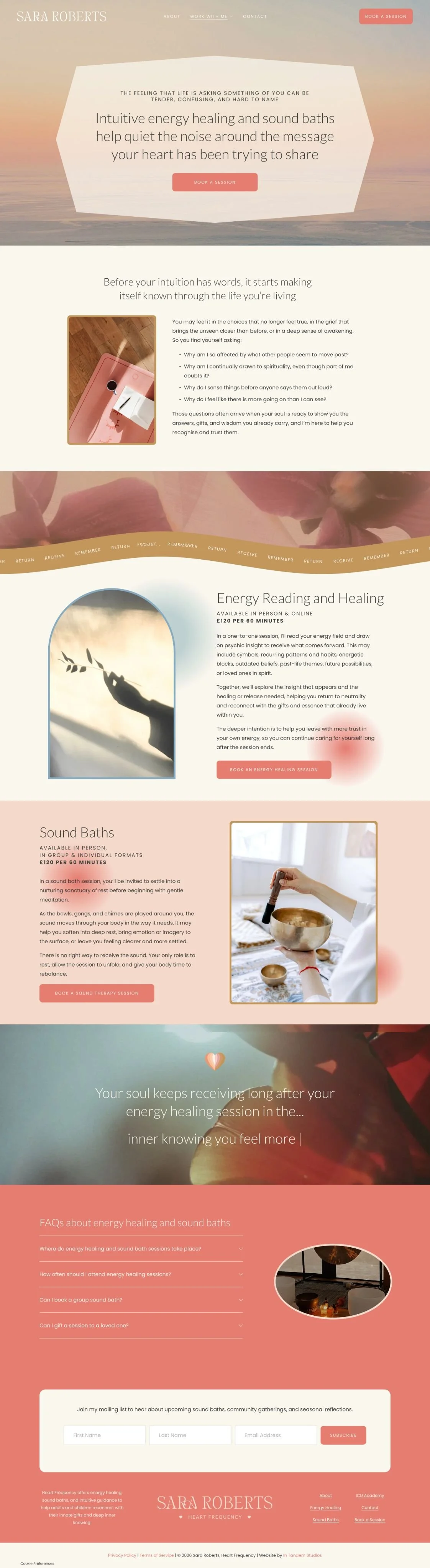
For branding, Samara started with the inspiration Sara had shared, then pulled in details that came up during our kick-off call: her love of water, the textures around her, and the calm, welcoming feeling she wanted Heart Frequency to have, all of which fed into the brand.
Even the purple shirt Sara was wearing and the green striped blanket behind her made their way into the visual inspiration.
The result was a Brand Design that felt soft and nurturing but still had these bright little bursts of colour running through it.
On the copy side, we gave the more intangible parts of Sara’s work some grounding with concrete imagery and clear pathways to each offer.
That meant bringing in elements like sea swims, scent, sound, process, and even a description of the physical studio where her sessions take place alongside language about energy, intuition, and the unseen.
Results:
Sara came out of Website In A Week with a visual identity of her own and a website that completely embraces the work she’s spent years being drawn to.
Instead of having to explain a collection of practices that are hard to put into words, Heart Frequency gives people a clearer way into her world, what she offers, and where they can begin.
The clearest sign that Sara got everything she wanted? She didn’t ask for a single change or revision.
Not the copy. Not the design. Nada.
We’ll be bragging about this one for months.

What comes first, copy or design?
With us, you don’t have to choose


We’re Isobel + Samara
The copywriter and designer who know weaving words and visuals together just makes sense. And we're helping busy business owners (like you) coast right past website stress into a site you can't wait to share.