
The Ocean Healing Institute
Project: Website In A Week
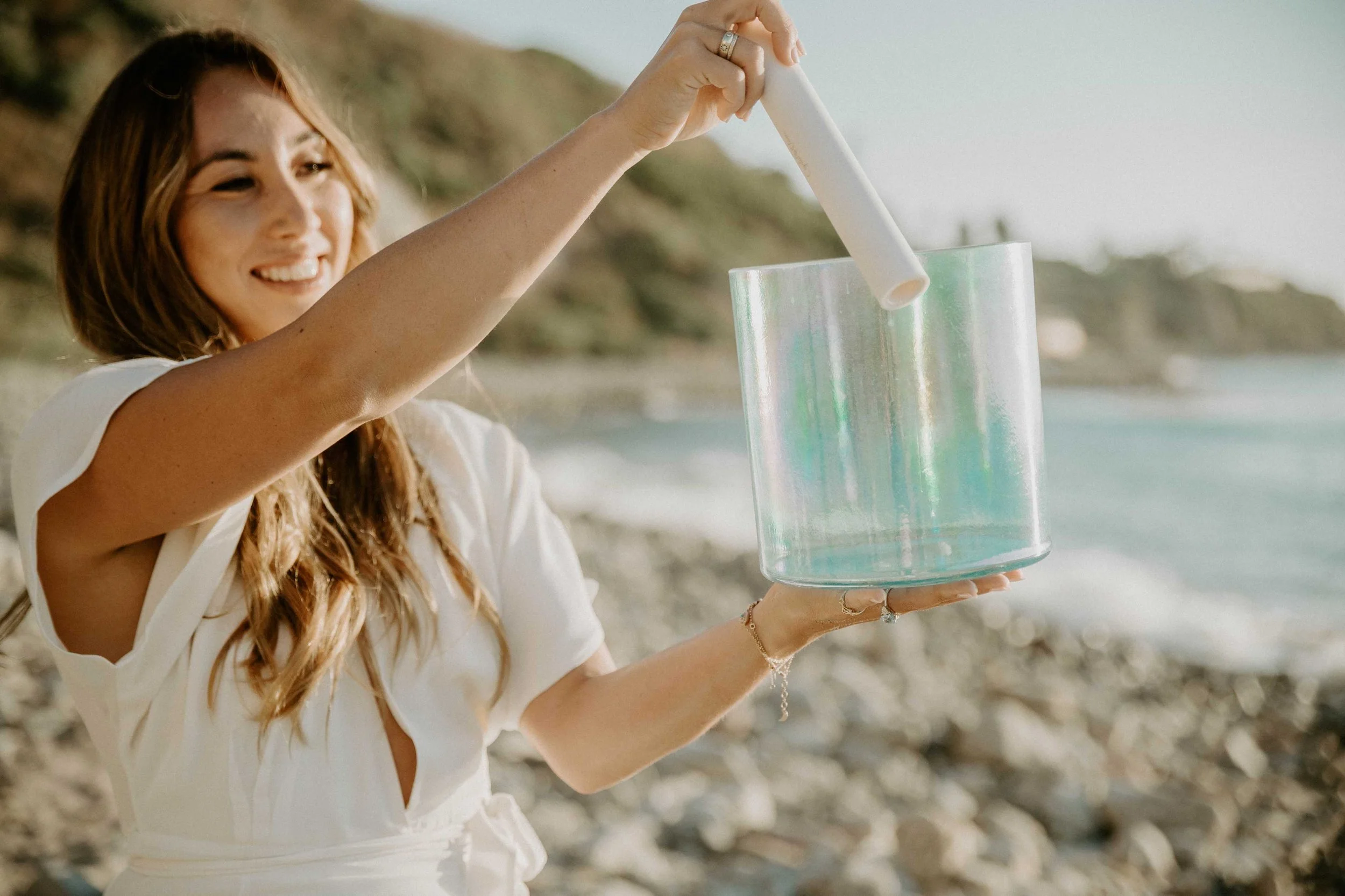
Client: Surf & Ocean THERAPY
Destination: A new, cohesive website for a growing institute
Journey Style: Calm, inspiring, elegant

Context:
Sophie was building something bigger than a personal brand.
Already a therapist, educator, and ocean-centred entrepreneur, she was in the middle of a major shift: moving from a solo healing practice to a more expansive body of work under The Ocean Healing Institute with therapy training, surf therapy, and community events.
A whole ecosystem, really.
She’d already worked with Isobel on sales page copy before, so there was some strong messaging in place. But this time, the goal was bigger: create a full website that felt cohesive, intentional, and capable of growing with the institute.
Challenge:
With Sophie moving from a solopreneur model into something more formalized, with a broader mission, more offers, and more room to grow.
At first, the scope was simple: home, about, events, and alumni. Sophie was in a busy season of life (caring for her new daughter) and hadn’t had time to fully plan out all the offers she wanted to create.
The challenge was building something that felt established enough for now and spacious enough for what was still evolving.
Solution:
We started with the essentials. Then, once Sophie saw how the copy and design were working together, the vision got bigger.
Which is honestly one of our favourite things to watch happen.
When we delivered the first website draft to Sophie, she suddenly saw what was possible for The Ocean Healing Institute when it had the right structure around it. So she asked to expand the scope.
That meant redesigning the sales page Isobel had already written so it felt fully integrated with the rest of the site, and adding another service page to support the growing offer suite.
Results:
Sophie came out of Website In A Week with a completely new website that helps her step out of a personal-brand-only model and into something more established.
Now, The Ocean Healing Institute has a site that fits the size of the vision: space for team members, space for new offers, and space for the work to keep evolving.
And the biggest shift? Cohesion.
Because when your business is growing into something bigger, your website should make that feel obvious. Not confusing. Not patchy. Not like you built half of it during nap time and prayed no one would notice.
So now, instead of having strong pieces floating around separately, the whole brand feels like it belongs together.
Happy Rider:
“The site looks absolutely beautiful. It completely matches the vibe and the energy I was looking for!”
Sophie Pyne, The Ocean Healing Institute

What comes first, copy or design?
With us, you don’t have to choose


We’re Isobel + Samara
The copywriter and designer who know weaving words and visuals together just makes sense. And we're helping busy business owners (like you) coast right past website stress into a site you can't wait to share.